


Back in the day when online qual was still very much in its infancy, we launched our platform Together™ and we’re extremely proud to have been one of the pioneers of asynchronous online qual.
To kick off our next phase of growth, we are launching our most significant platform upgrade in Further’s history, Together™ 2.0.
In development for close to 2 years, our product development team has worked tirelessly to integrate as much of your feedback as possible into creating the improvements that matter most to you.
The key features of this update are:
- Screen Recordings
- Vastly enhanced mobile-friendly 'researcher' interface
However, this release also includes important improvements to Together's™usability and performance, these include:
- Screen Recording
- Mobile-friendly ‘Researcher’ interface
- Emoji support
- Enhanced branding & styling options
- Streamlined ‘Rooms’
- Improved user uploading
- Markup makeover
- Participant Calendar
- ‘Report Friendly’ charts
- Picture ‘Choice’ Questions
- Automatic Project Invites
Screen Recording

Users will now be able to capture and understand the experiences and behaviours of audiences and consumers in greater depth than ever before…and even more easily!
Perfect for conducting UX research, online shop-alongs, consumer journeys, path to purchase, usability testing and on-screen experience mapping…screen recording lets you see exactly what your participants are seeing, in the moment and without having to be there in person.
Available to both participants and administrators, Further's Screen Recording can be used to effectively capture what people are doing on their computers while simultaneously recording them narrating their experience or commentary.
It can be used independently or in conjunction with all of Together's™ existing activity tools allowing you to seamlessly switch from testing concepts and ads, to gathering day-to-day behaviours, to hosting group discussion and now, to viewing the on-screen world of your participants.
Find out more about screen recording here.
Mobile-Friendly Researcher Interface
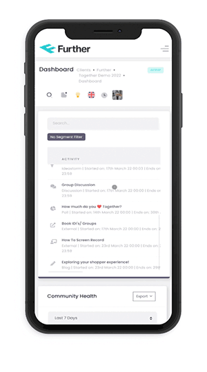
Participants have always been able to easily experience and engage with Together through their phones, and now researchers can too.
A fantastic new desktop interface now seamlessly responds and optimises for the environment it is in - whether tablet, mobile or PC. This means that researchers can moderate, tweak, create and manage on the move. There is nothing to re-learn just a vastly improved, more streamlined experience and the ability to do your work wherever, whenever and however you want to do it…just as it should be!
Emoji & GIF Supported
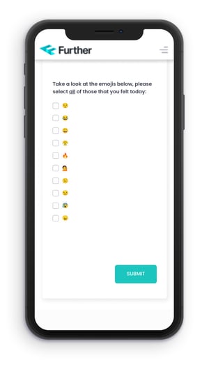
Why write how you feel when you can simply show it!?
Participants share best when they can express themselves on their terms, which is why we have made sure that Together™ 2.0 provides them with the same engagement options they are used to on other social media platforms. So now your participants can cry tears of joy, hide their monkey paws in shame or gif their way to glory…and you can too!
Use these options as question types, when creating activities or even when moderating.
Enhanced branding & styling options
We find that the better a study looks, the more engaged participants are.....but we're the first to admit that this wasn’t always easy to achieve with previous versions of our platform.
However, with our latest upgrade, Together™ supports extensive branding customisation so that you can easily reflect the look and feel of your agency, client brand, project or audience. With every change displayed beautifully, and responsively, across all devices
- Display a beautiful background, client name, or project theme using the homepage banner.
- Stylise each task using an image of your choice, stimulus from your study, or an image from a stock selection available.
- Group your tasks together using our streamlined Room system (see below)
- Set the study tone from the very beginning by customising the welcome text, image, colour and logo of your project on the ‘Log on’ screen
Streamlined ‘Rooms’ Management
Together's™ ‘Rooms’ system has always offered a convenient way to group your tasks and create a bespoke visual interface for your participants.
Set up now is as simple as selecting your layout and dropping the images you want into the right spaces. Any text you want to be displayed is automatically overlaid, and we’ve even provided some extra style options to suit your taste. Focus your participants on your study by day, theme, category etc.

Improved User Uploading
Uploading users to a platform is part and parcel of any project but it can also be fiddly and time-consuming, particularly when it comes to adding demographic data for segmentation. We’re always looking at ways to make the research process easier, so now whether you have 5 or 50 participants, you can copy and paste their emails into the upload box, and then use our quick select table system to match the right segments to the right user.
Say goodbye to CSV downloads, tick boxes or imports forever!

Mark up Makeover
Just because Markup is one of our most used (and loved) activities…doesn’t mean it couldn’t use a makeover. Giving respondents the tools they need to mark up concepts, print ads or other stimulus with likes, dislikes or comments needs to be easy and fun.
Modified to now display images and video with greater clarity and enhanced zoom, Markup offers participants an engaging way to directly interact with stimulus and helps you identify aggregated areas of interest and emotional resonance.
Improved Participant Calendar
Sometimes it can be challenging for participants to keep track of what they need to do within a study (no matter how well-briefed!).
To help keep people on track we have redesigned the calendar widget, with each new task published appearing on the corresponding day and accessible through the calendar itself.
‘Report Friendly’ Charts
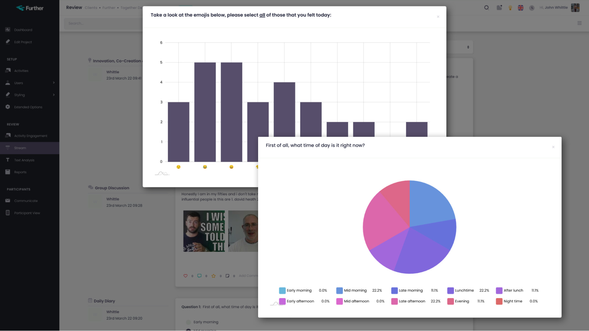
A great research platform shouldn’t just help you gather data, it should make it easy for you to tell the right story and to be able to easily share that story with clients.
With more substantial improvements scheduled for later in the year, our first step has been to update the styling of our graphs and charts. You can customise the default color theme for all charts in a study and then simply export these in the format you need to drop them straight into your report. Simple!
Picture ‘Choice’ Questions

As the old saying goes, ‘A picture paints a thousand words’. Well now you can paint, and get your participants to choose from, many thousands of words through creating picture-focused single, choice and ranking questions. Perfect for when you need to keep visuals top of mind in important product or feature selections.
Automatic Project Invites
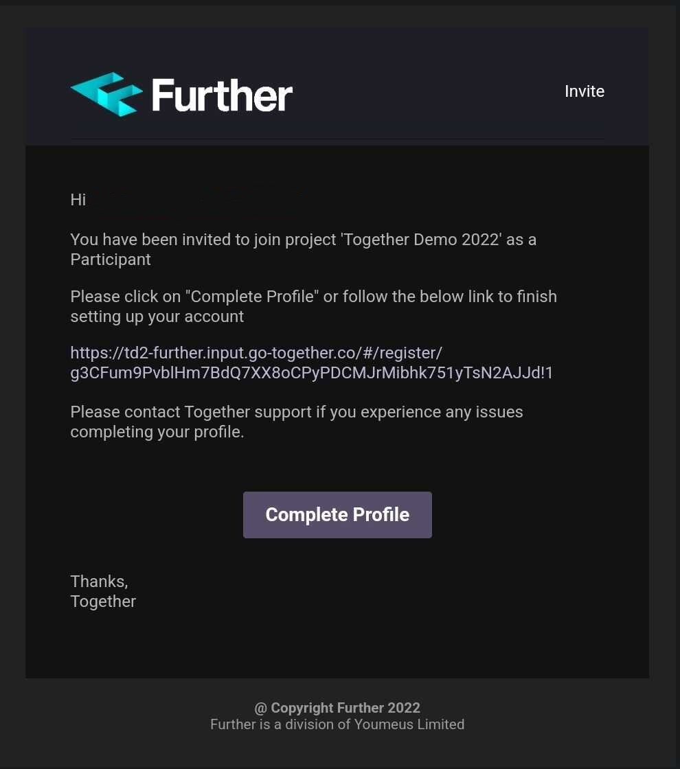
Our aim has always been to try and make your research life easier, and with Together 2.0 we want to make sure we achieve that even more effectively. With this in mind, we are trying to cut down on some of the steps that are a natural part of every project. Like creating and sending out an invitation to your participants.
Whilst you will still be able to use the communicate tab to welcome your participants if you want to, and engage with them throughout the project, the system now takes care of the initial invite.
Simply upload your participants, select those that you want to onboard and then click ‘Send invite’. Take a peek below to see an example of this invite…
We really hope you enjoy this round-up of Together's new features and improvements. The significant overhaul of the platform's solution architecture means our product development team is now able to bring out more features, more quickly than ever before.
There will be a significant number of new releases coming up over the coming months, so be sure to look out for further announcements and if you have any questions, why not get in contact with our customer success team or book a demo with one of the team.


.webp)
.webp)
.webp)
.webp)